Email Design 2017 #2 GRADIENTS
Flat colours are so like…2015. In the second in our series of posts on trends in email design, we’re looking at gradients and how they seem to have an uncanny knack of being included in all the most attractive emails vying for attention in our inboxes.
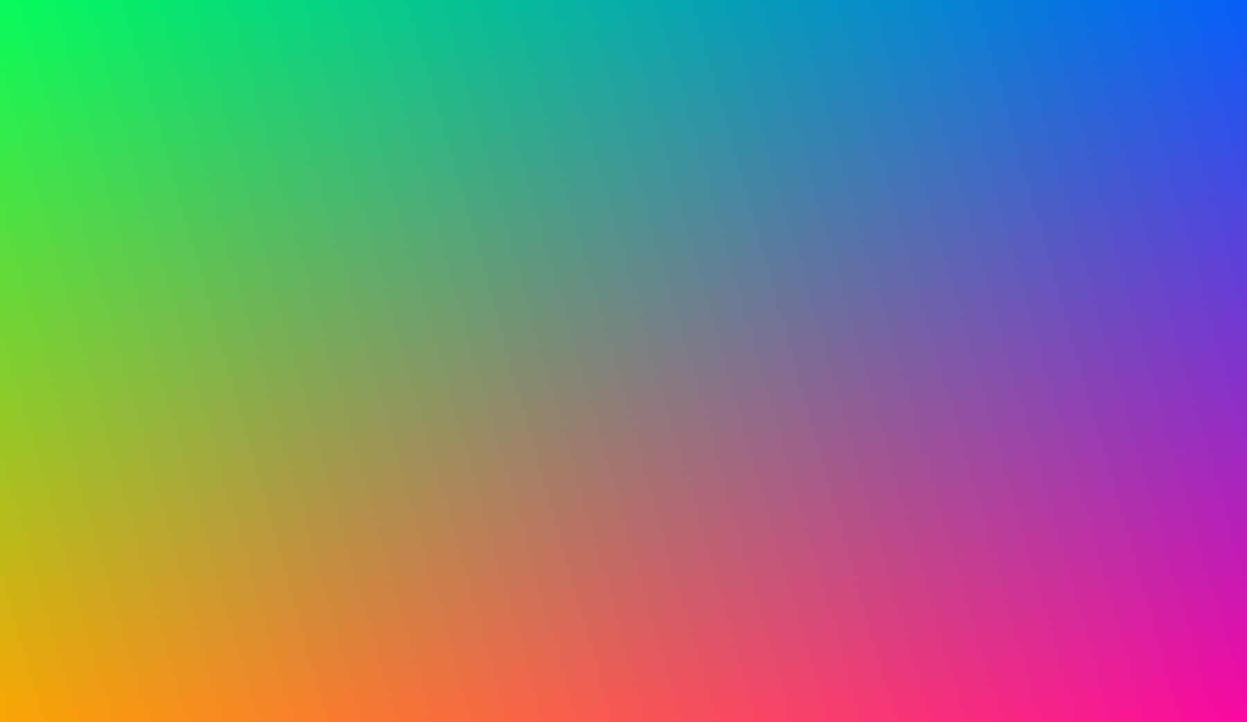
T’was a time in the not so distant past that flat colours were all the rage in email design. Keep it simple. Keep the file size down. Less is more we were told. Now it seems the email design community has breathed a collective MEH! And started using gradients (two or more colours that fade into each other).
It’s easy to understand why, especially when brands are looking to stand out from the crowd. How can any brand ‘own’ a colour anymore? “Coke totally owns red”. Well, what about Vodafone? Or McDonald’s? Or Virgin? Or…well you get the idea. Gradients can help a brand find a new way of defining itself in colour. Take Instagram’s logo:

Gradients open up a whole new colour palate for designers. And it’s a palate that contains literally millions of colour combinations. But greater choice, and therefore the opportunity for better stand out isn’t the only attraction.
Gradients feel more realistic than flat colours. In real life, nothing is one consistent colour. Look around you right now. There are hues, shade and reflections – countless minute subtleties that our brains are used to processing. Perhaps that’s why they’re just so damn pleasing to look at!
So why haven’t gradients been used more widely in email design until recently? Well, that would be our old friend file size. Gradients are more complex than flat colours. They contain more information and are bigger as a result. Using them impacts your image to text ratio and can negatively affect your spam score.
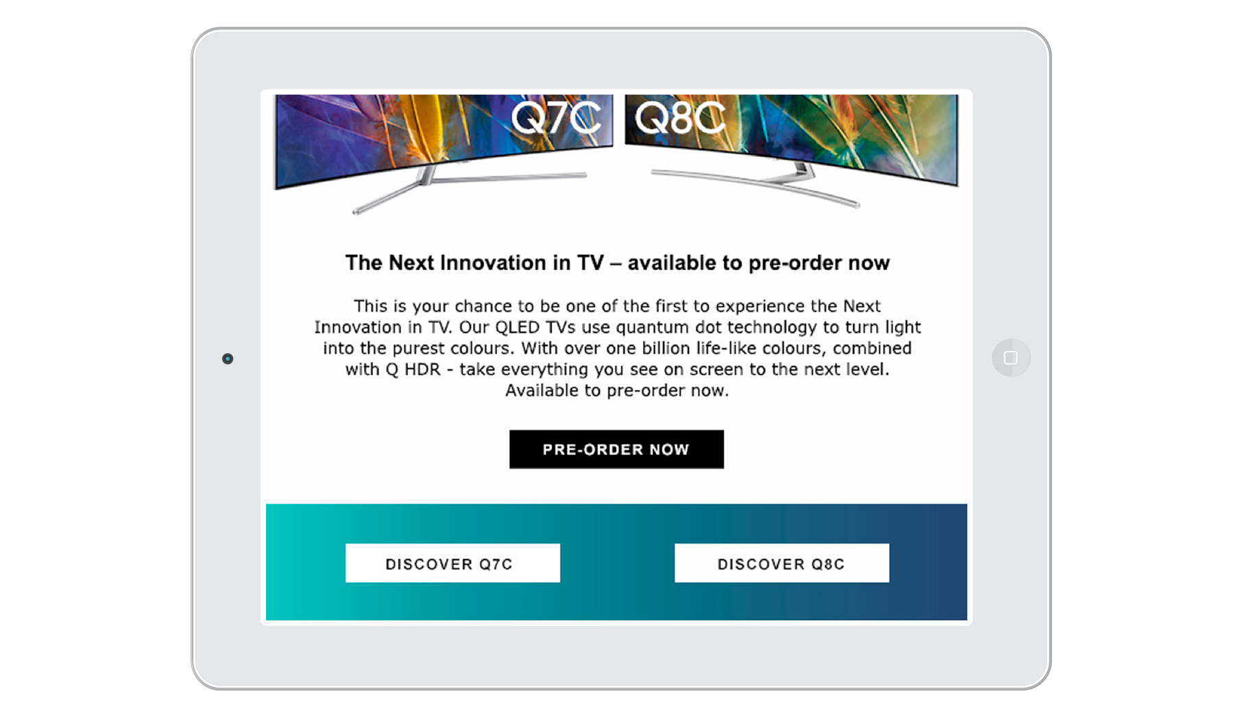
At Flourish we’ve been creating gradients in CSS and using them as backgrounds, so that we get the standout, but also so that copy and CTAs can still be live text.

CSS gradients are supported in the majority of email clients and you can always use a flat colour as a fall back for those that don’t support CSS gradients. The best of both worlds you might say!
If you’d like to pick our brains on any aspect of email design just get in touch with Ian Reeves. We’ll be happy to help you turn your email design dreams into reality.
