
Email Design 2017 #3 Hover States in Email
With each email client rendering code slightly differently, interactivity in email has always been fairly tricky to implement. In the third in our series of posts on trends in email design, we’re looking at hover states, and how they can be used to enhance emails to improve click to open rates.
A conservative estimate is that 61% of email clients support basic interactive elements. At Flourish, we take a strict stance on support and only use hover as progressive enhancement on desktop clients (as obviously you can’t mouseover on a mobile).
The hover effects we find ourselves using most often are:
Button Colour:
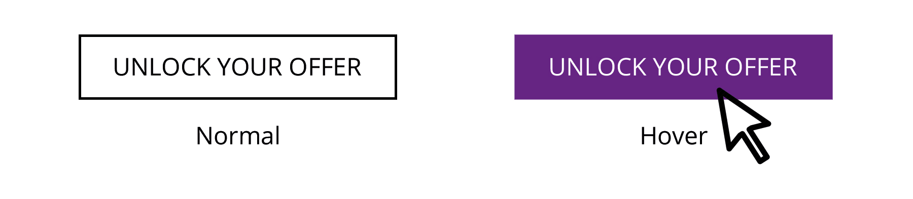
We either swap colours on hover or add a fade effect to transition into a % of the colour used. The result is the same as we see on websites every day.
Image Swap:
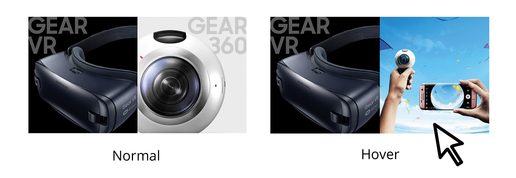
We find this particularly useful in product emails where we can show a different view of the product on mouseover. While this shouldn’t replace multiple product shots, it is a nice enhancement to an email.
There are plenty of other mouseover techniques including:
Text – change colour, underline and even add drop shadows.
Fade – Add a fade to text, images or tables. Change the colour of the fade and add opacity. Especially useful for logos and icons.
We’ve seen a positive impact on email statistics by when implementing hover techniques. They really help to make our emails look great as well!
If you’d like to pick our brains on any aspect of email design just get in touch with Ian Reeves. We’ll be happy to help you turn your email design dreams into reality.